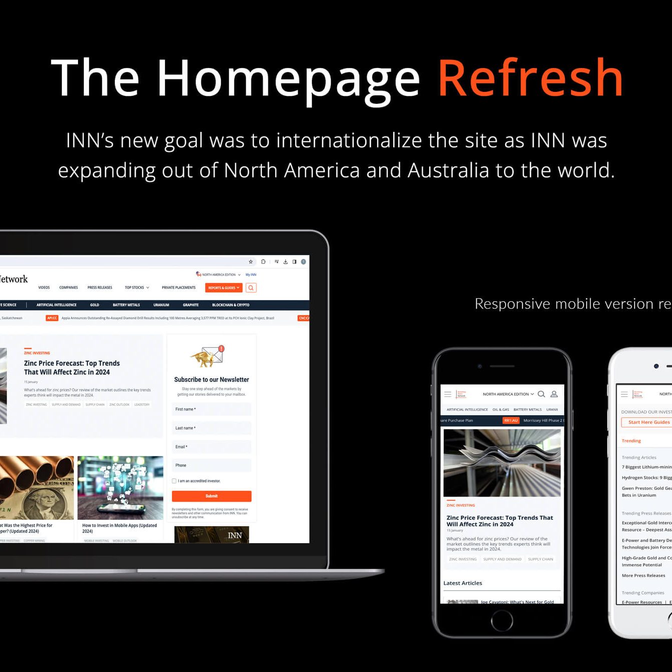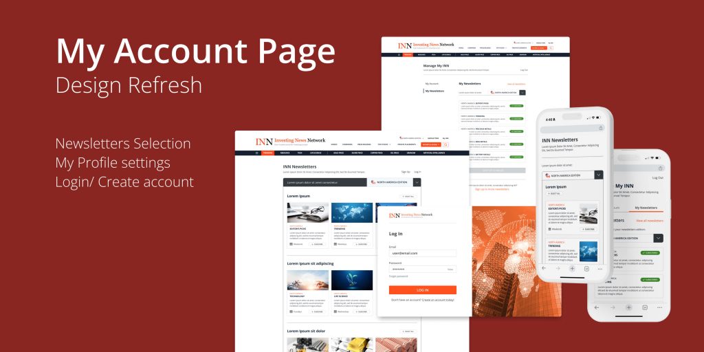
A design refresh to improve and make clear cuts on the user experience in the flows for logging in/creating accounts, newsletters selection, making changes to my profile settings, and newsletter subscriptions.
Identifying the Problem
The original design was very distracting for users to have newsletter selection and profile settings editing on the same page side by side, as well as having an outdated log in landing page adds confusion to the flow in accessing the my account page.
Through deep dive and UX research on ways to improve the flow, we have come to a solution to separate the different actions into separate pages to make the experience seamless.
Design Research and Process
The My Account page was disorganized with multiple functions users can interact with making it very confusing for users in the experience. After a deep dive into this process, we have developed a new goal to not only improve the efficiency of the users’ experience in looking for their needs of making changes to both newsletter subscriptions and profile settings but also to clear and tidy up the newsletters to align with the needs of the stakeholders, ultimately to improve successful leads.
First, UX research was needed on what flow works best for users specifically meeting our users’ needs and requirements, as well as common practices on newsletter selection, editing my profile and newsletter subscriptions, log-in and create-account flows.
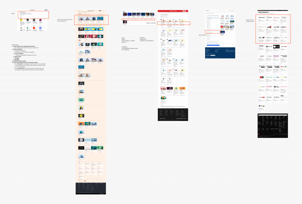
Exploration and analysis of requirements and users’ needs.
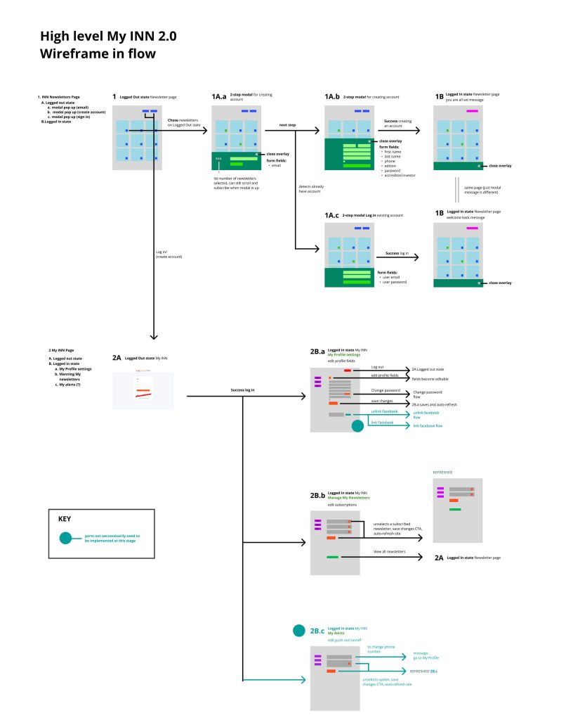
Once the requirements were filled, the first flow at a high level was mapped out as users of different scenarios for initial discussions with the devs.
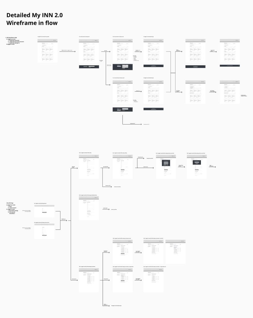
After further discussion with the product manager, a more detailed flow was mapped out to present the logic and ensure all requirements were met.
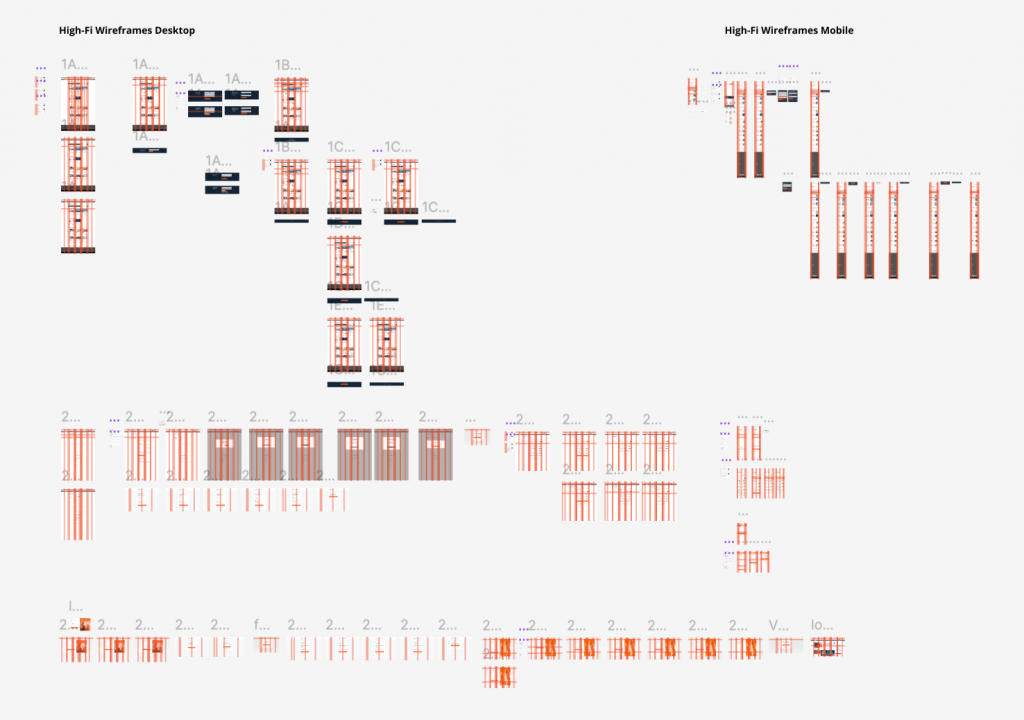
The finalized prototype was then developed with more realistic details, such as imagery, text copy, buttons, animated flows, etc. This was presented to the stakeholders ready devs to develop and for usability testing.
The Final Product
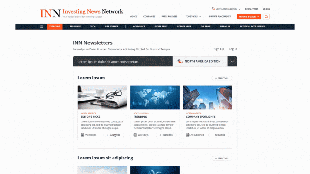

INN Newsletters Page – Subscribing:
This page allows logged-in and logged-out users to view all the newsletters available for selection. Starting as a logged-out user, when you select to subscribe, you will be prompted to submit an email address, then it determines whether to log in as an existing user or create a new account. This process allows direct access to newsletters selection, whether the user is logged in or not.
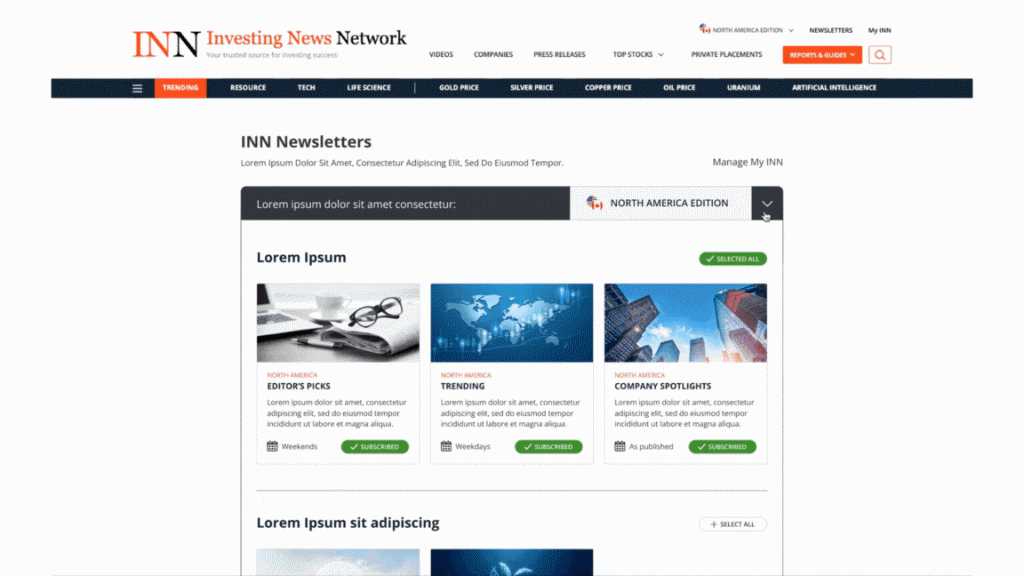
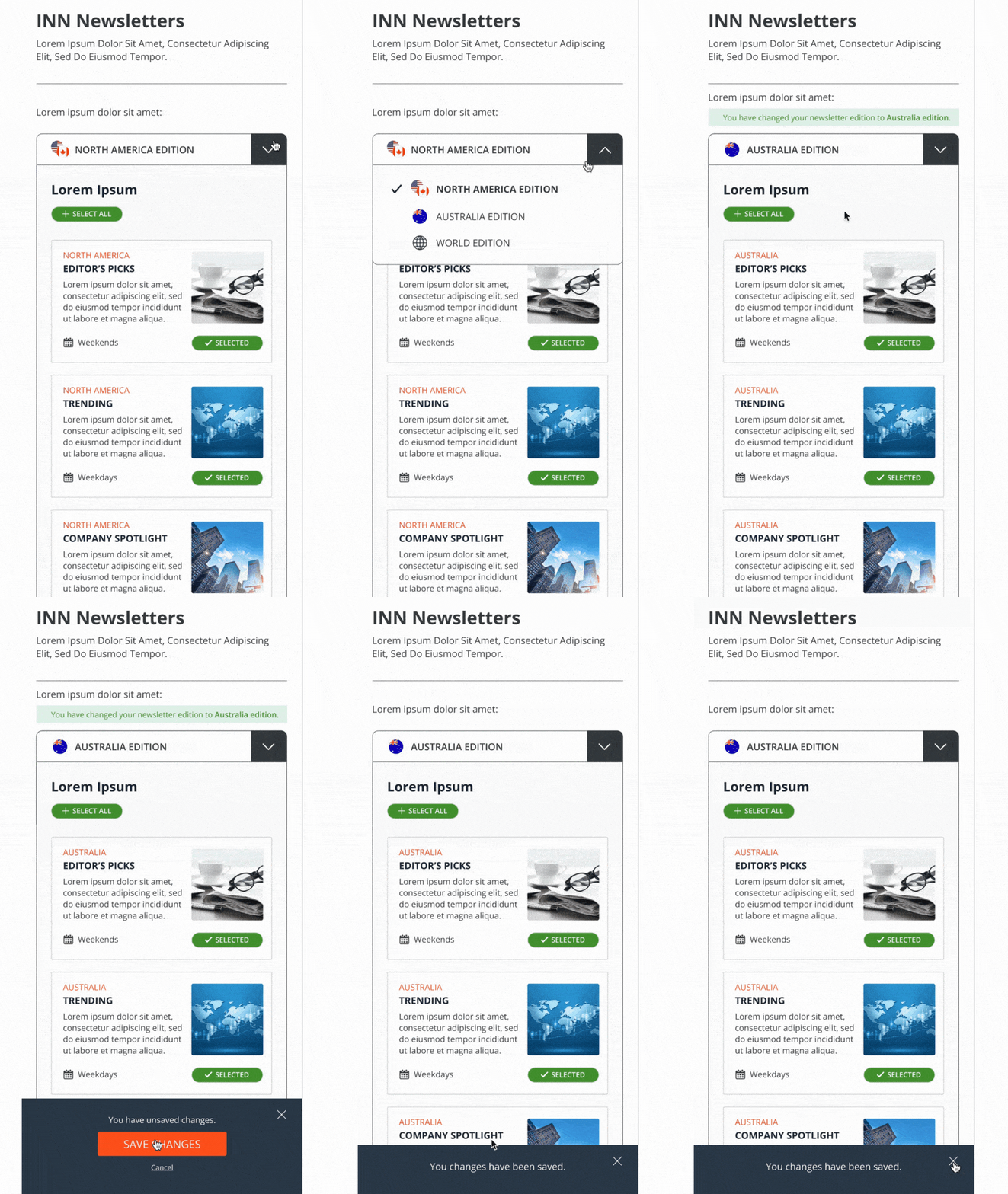
INN Newsletters Page – Edition change:
A change of edition (between North America, Australia, and World editions) is added to comply with the new newsletter schedule for a more organized and structured manner, such that subscribers avoid getting repeated content and focus on the region of news they are subscribed to.
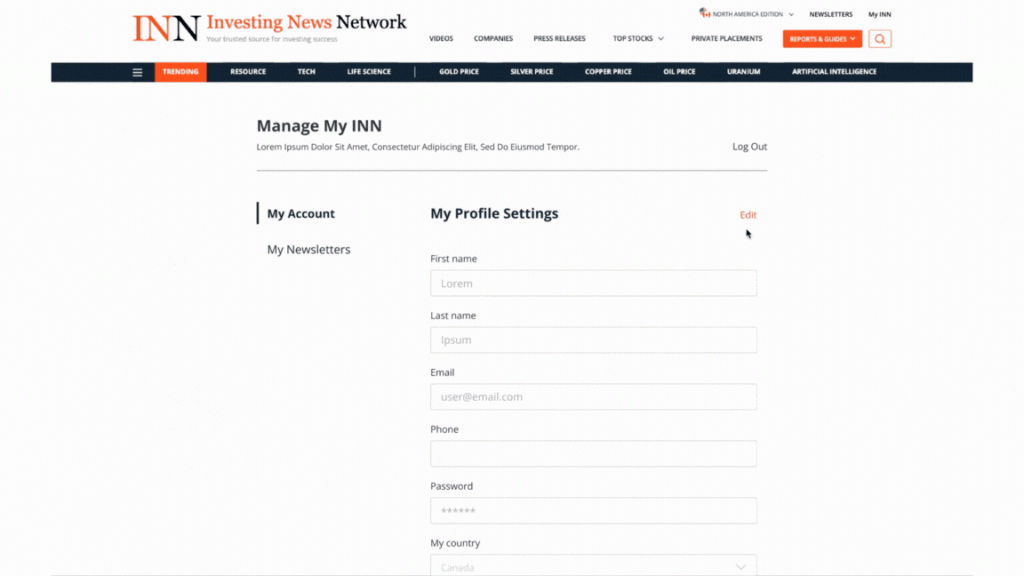

My Account Page – Manage profile:
Separating the My Accounts Management function on a new page allows users to focus on the common actions desired in updating profile settings and avoid distraction with the newsletter selection process, which was laid out on the same page in the original design.
Additional features have also been added to allow users to customize and set up their accounts at a more specific level to fit their individual needs.
Some features the users can perform are as follows:
– Editing profile details
– Change passwords (new flow created)
– Change profile edition
– Link or disconnect social logins (new flow created)
– Delete account (new flow created)
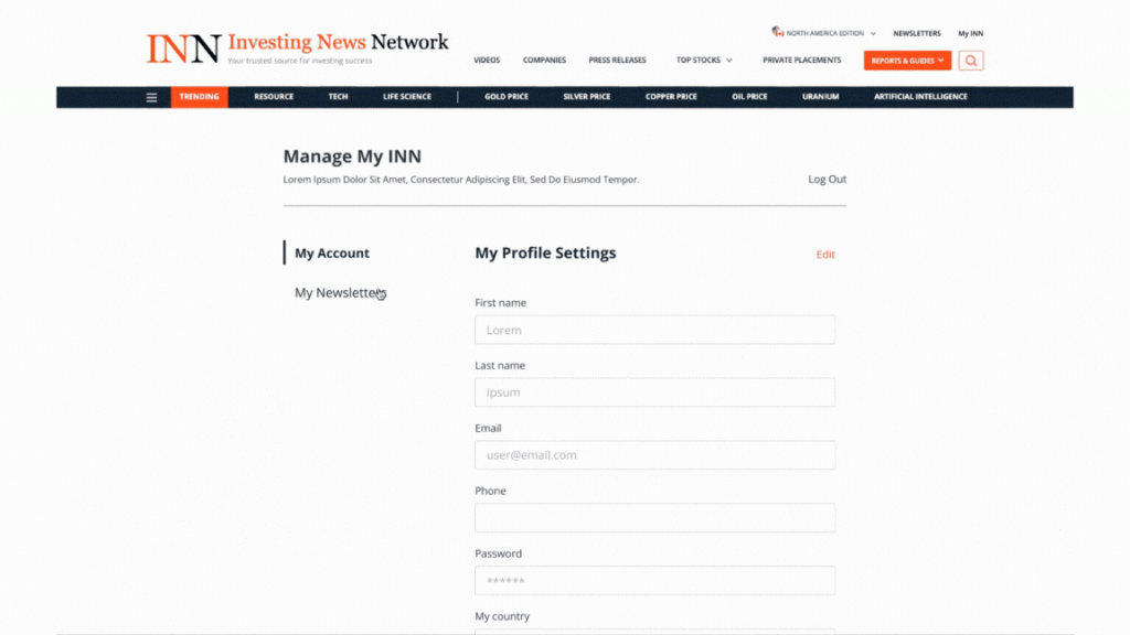
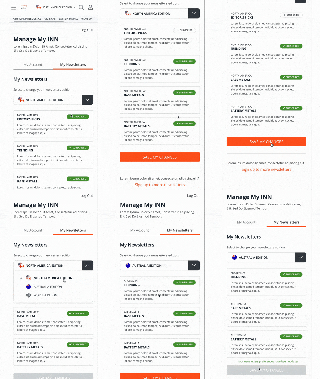
My Account Page – Manage my subscriptions:
My Newsletters page serves the purpose of elevating the user experience when customizing their newsletter subscriptions. With this element, users are able to easily scan through the newsletters they have subscribed to without the distraction of other non-selected newsletters. This gives users a rough idea of what they will be receiving in their emails. They will also be able to easily change their newsletter edition here for those they have subscribed to.
Log-in/Create Account Pages:
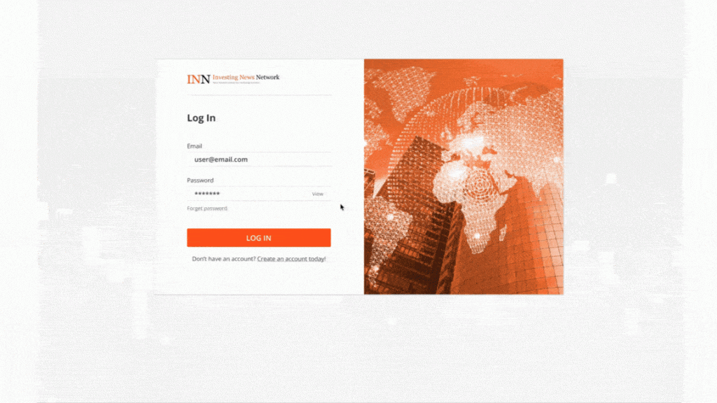
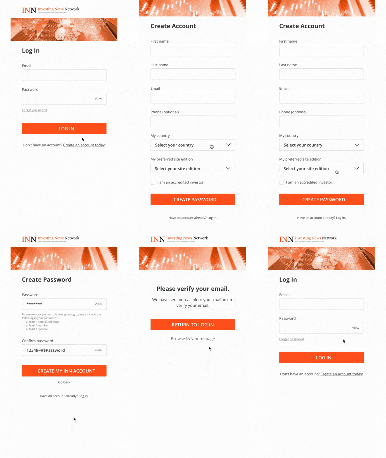
It was a huge misstep to not have a page for new users to create an account. With the old-fashioned and boring log-in screen from the original design, the My Account page (My INN) has been re-designed to not only look more professional but also to give a sense of what the INN brand is about. A new addition to the Create An Account page has been designed to finally welcome newcomers and improve on leads.
Some elements the users can perform are as follows:
– Log-in as existing users or create an account as new users
– Forget password (new flow created)
– Create password and new user confirmation (new flow created)


