Our Team

Theenuja Navaratnarajah

Richelle Leung

Jacob Papainni

Umar Iqbal
Brand Position
WE HAVE IT COVERED
It is a very rare kit on the go that serves the purpose of having a safe and clean toilet to use anywhere and anytime. It is a quick-fix survival kit that solves all public toilet issues we face, especially when we are in unfamiliar places.
By the team
Brand Logo
The new identity can be configured vertically (primary logo) or horizontally (secondary logo).
Each logo is made up of two components: the symbol, which is represented as bubbles to signify our products and position, and the typography, where Domus Titling in Bold and Regular face was used.
By the team
Brand Colors
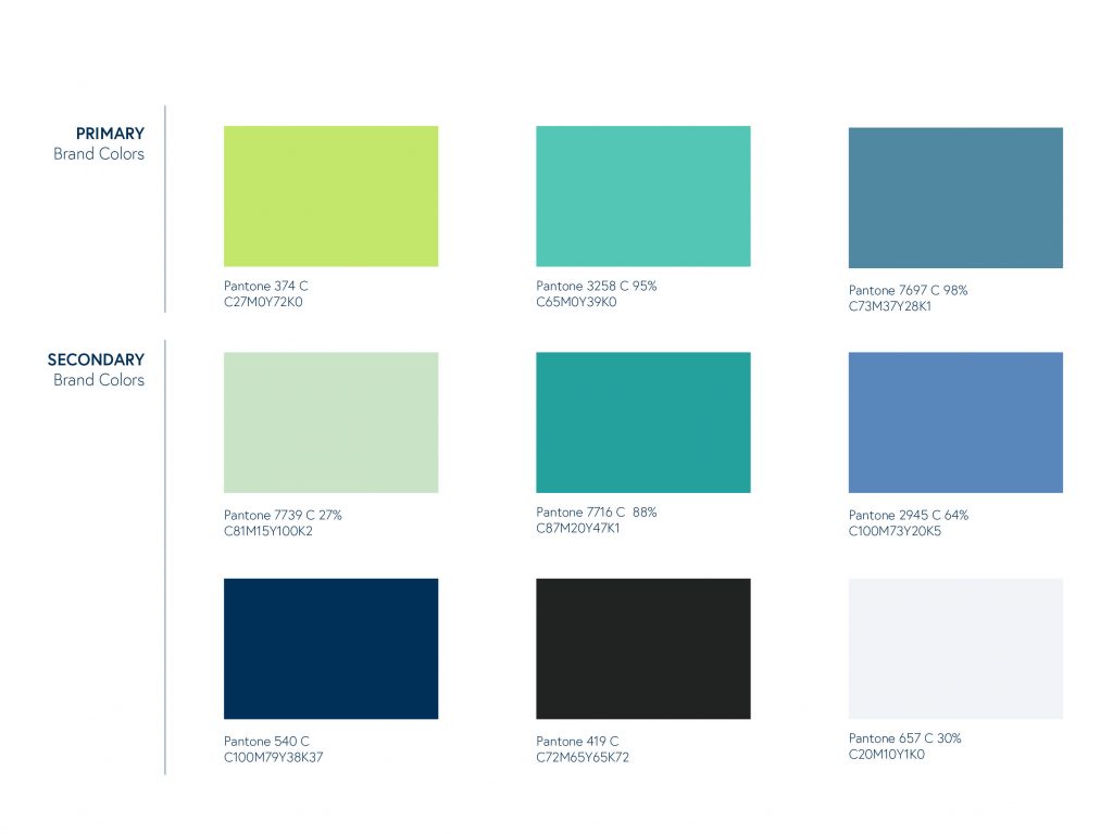
DOOKIT’s unique brand colours are
defined by the appealing and friendly colour palette that represents a sense of comfort and trust.
The secondary colours should be used scarcely and as accents. Corporate colours, carefully applied, will impart a consistent look and gravitational feel to all DOOKIT visuals. Never substitute or replace colours.
By Richelle Leung
Brand Typography
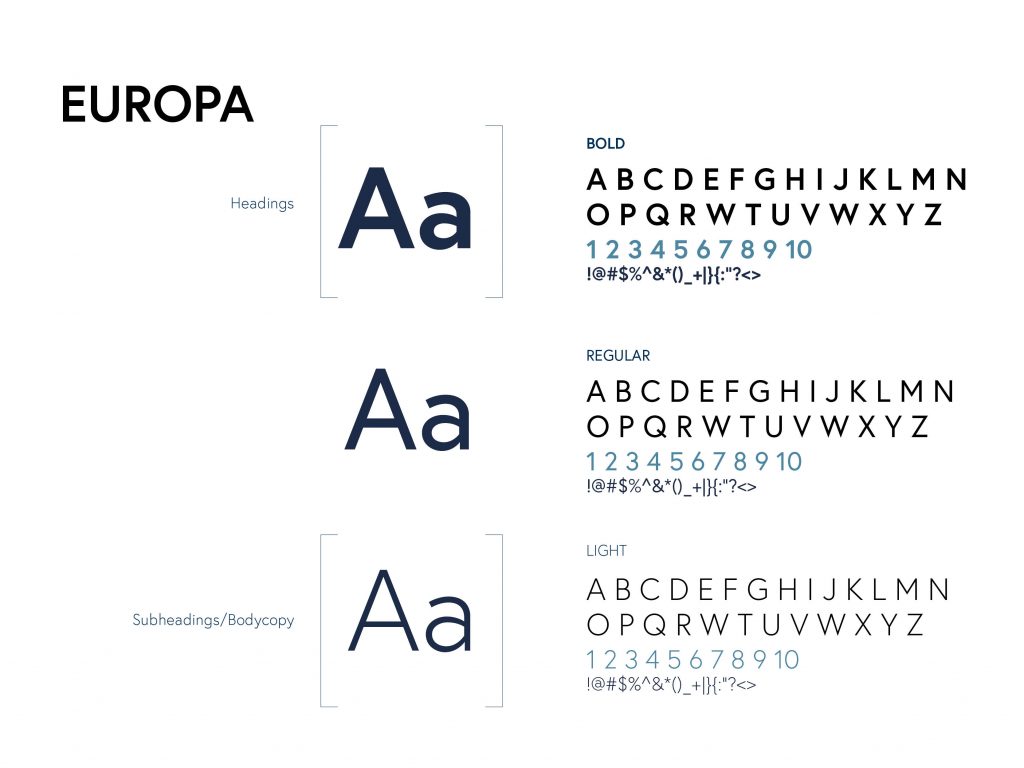
The following typefaces have been carefully chosen to reinforce our identity and ensure easy recognition. Consistent use of these types of families will contribute to a unified brand image in all brand communications.
Preferably using Europa-Bold for headings and Europa-Light for subheadings and body copy.
By the Team
Graphic Elements
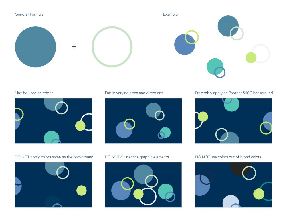
Our design elements are circular bubble looking shapes that give off a nice, clean feeling when looked at. This allows DOOKIT to keep a fresh look.
Art Direction
To achieve our branding standards, pair a solid color circle with a stroke-outlined circle. Use in alternating sizes overlapping and in brand colors only.
By Richelle Leung
Brand Iconography
Powerful iconography enables our communications to make a far more direct and emotive connection with
our audiences.
Icons in our branding present information visually and aid audiences to further understand the information in texts form. Icons are preferably in shapes and solid colors.

By Jacob Papaianni
Brand Identity Applications
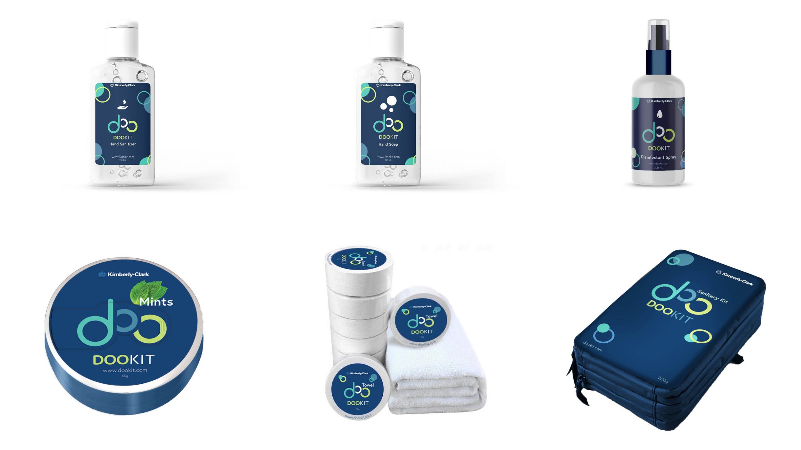
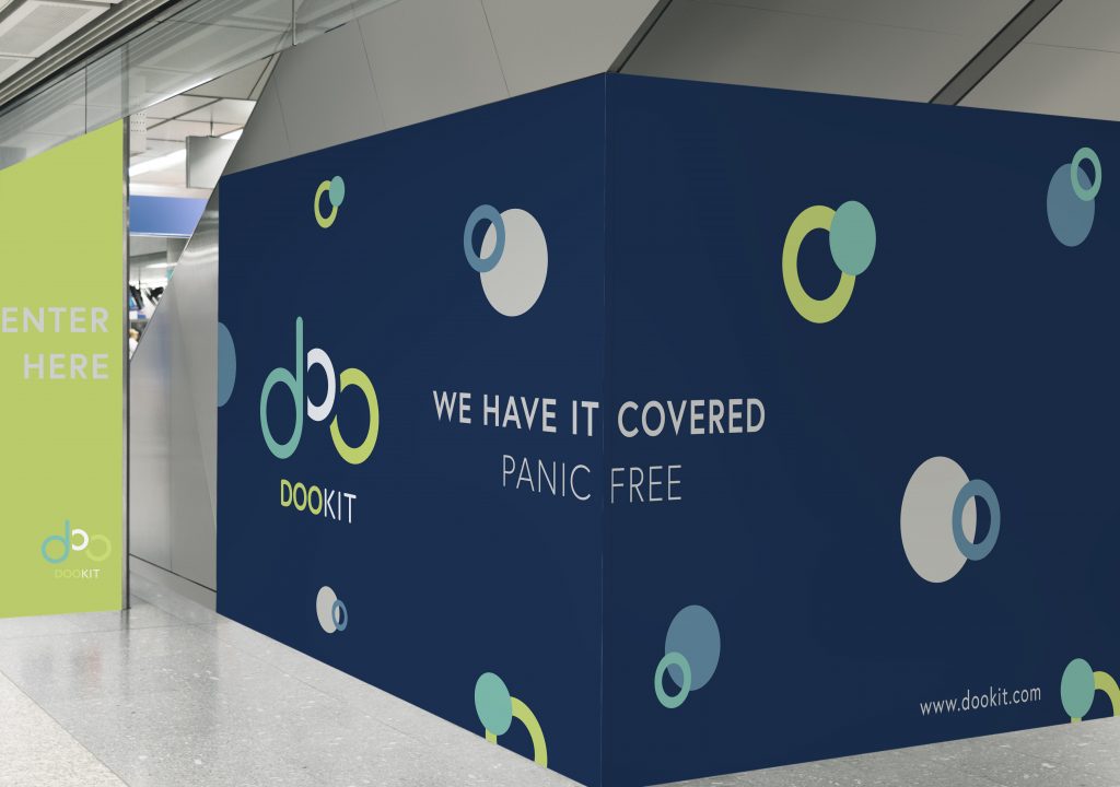
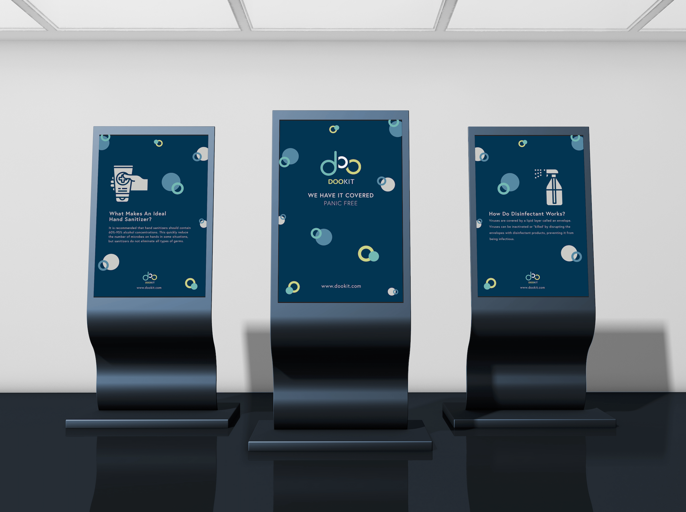
To ensure the visual identity comes to life effectively across various media touch-points, please adhere to the following examples of proper logo usage. This will ensure correct, consistent, and creative applications.
Details include the usage of logo, positioning statement, colors, and our graphic elements.
By the Team
By Richelle Leung
