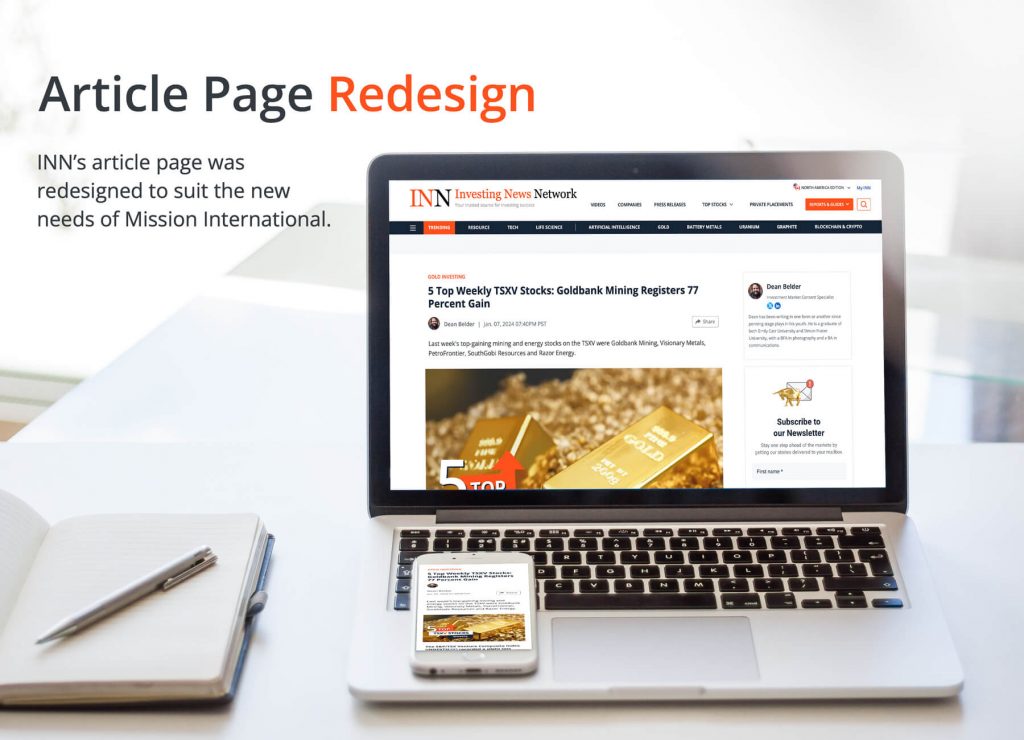
INN’s article page looked outdated and needed a change to fulfill needs not only in the user’s perspective, but also for the editorial and marketing teams.


After recognizing the needs from the editorial and marketing teams, and exploring what the users experience, I have re-designed the article page by attaching additional sections on the sidebar to allow users to scan through information of trending topics. The text width and font color have also been adjusted to allow for more comfortable reading.
New sections (Next Up, Discover More, Related Tags) were also added at the bottom when users’ interests and Mouseflow analytics were explored, which resulted in a significant increase in sites engagement.
Design Research and Process
Turning the new article site live started with a “mood board” that dives into what the competitors were doing, what the good and standard practices were in action.
Further exploration and analysis of why different sites have the specific features and designs, juggling the goals and users’ needs and interests were next. Working closely with the editorial and marketing team, a new design was mapped out with the perfect balance for all the different needs.
Last but not least, due to the limitations of time and complexity issues from the dev team, more adjustments had to be made, yet keeping in mind the specified needs at all times.
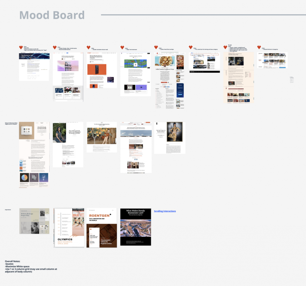
Exploration and analysis of competitors and users’ interests.

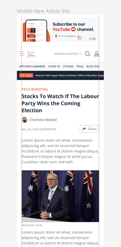
Desktop and mobile prototyping.
